Anyone that has spent time exploring the world of printmaking will realize how expansive (perhaps infinite) it really is. Layering, paper choice, various inks, combining different types of printmaking, and even techniques like chine-collé… anything is possible! The ability to easily create complex images in printmaking is just “built in” because the world of printmaking has limitless options!
For me though, there has always been something beautiful about not using those options. To me there is something that is nothing short of magical about what can be accomplished on a single plate or block by someone that really knows what they are doing.

The image above was done by Albrecht Dürer in 1505. It’s a single, engraved plate that produces an image of incredible depth and richness – all through a mastery of line work.
Line work, with concepts like directionality of the lines, width of the lines, tapering lines… all of which combine in a way that tricks the mind into seeing an image that appears more complex than it is. The reality is that the “building blocks” are simple. If you look close, you can see exactly what Dürer did piece by piece. I think that is what draws me to prints like this! But to take those simple building blocks, and really understand how to put them all together in a way that can produce an image like this… that’s the magic.
So while I will probably never master it to the level that Albrecht Dürer did, I want to get better. The only way I could come up with to get better at understanding line work is to start creating prints with line work.
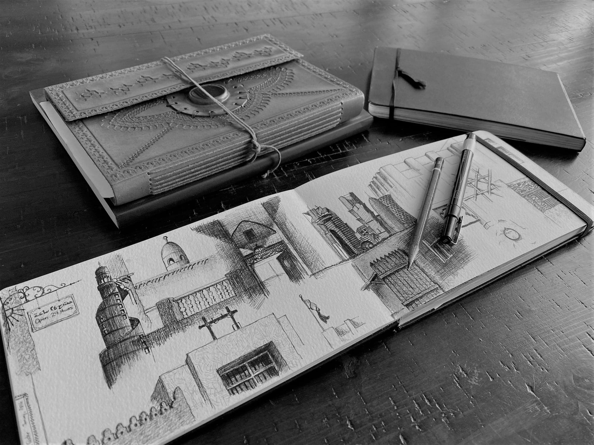
SKETCHBOOK
It all starts for me with some basic sketching. My years in art school were spent in etching and drawing with ink, and relief printing already challenges me a bit. So I have to really try to sketch with relief in mind. In this case, I picked something from my living room and dove in.

The most important part of this sketch to me was to avoid any shading with my pen, which is hard because it’s something I do without thinking. Instead, I really had to focus on capturing light, but if I needed a gray, it would have to be represented through line work.
In a dimly lit room, the lamp casts bright light in cone shapes coming from the top and bottom of the lamp shade, but the space surrounding the rest of the lamp shade isn’t dark… it’s just less bright. So I tried to represent this with narrow, horizontal lines.
I also spent a bit of time really focused on the reflective glare on the body of the lamp. The more I looked at it, the more I realized the reflections of light followed the contour of the body. While it appears truly as black and white, it’s the direction (or curve) of the reflections that really make the body of the lamp feel substantial. This would be important to capture correctly.
TRANSFERRING TO A BLOCK
Something that has always been difficult for me (and in all honesty has kept me from doing relief prints) is being able to let go of a sketch to let it become a print. It’s important because truly embracing the idea of a drawing becoming “something else” as it is realized as a print allows that image to develop in different, and hopefully better, ways. Each of the sketches I have converted to a print have shared one thing in common: I knew they were going to be prints before I started drawing, which meant I knew I would be redrawing them on a plate or a block, and the finished image would not be the same.
So begins the redrawing process. In this case, I did it immediately after my sketch was done, so I was still acutely aware of the importance of the reflections, and understanding how they required a direction in order to really define the body of the lamp.
One challenge for me was the fabric like texture of the lampshade. While I really tried to draw as if I was carving, old habits die hard, and in the sketch I mistakenly used a scribbly texture on the lampshade. During the redrawing, I had to rethink this, and decided to try thin horizontal lines that could follow the shape of the shade.
The other challenge, the “slightly darker” light outside of the bright cones cast by the lamp, I had already drawn as horizontal lines in the sketch, so I thought they could potentially intersect nicely with the horizontal lines in the lamp shade, and the change in direction would make them appear as completely separate things; a physical lampshade, and light being emitted.

With the horizontal lines however, I really wanted them to feel like light. The light in this case was amorphous, haloed, and didn’t just end where the plate ends. After looking at other printmakers (like Albrecht Dürer above), I felt like this would be a great time to work on tapering lines, letting the whitespace of the paper seep in, giving the illusion of the slightly darker light on the sides of the lamp shade eventually merging cleanly with rest of the light in the room (or in this case on the paper).
I also wanted to take the benefits of relief printing for a test drive. Since it is a “raised surface” medium (meaning the ink sits on the surface of the block above the non-printing regions) the resulting image doesn’t have to be constrained by the boundaries of the block.This engraving by Gustave Doré demonstrates the opposite: intaglio is a process that prints off of an “incised surface” where the surface is the non-printing region, and the image is produced from ink trapped in grooves beneath the surface level. The result of this is that when you print that image, a plate mark results (unless your paper is smaller than the plate). Even if you surround the printable area with whitespace all the way to the edge, there will still be a physically embossed rectangle that outlines the image area.

Because this was going to be printed in relief, I could use paper larger than the plate I was printing from, and I could make the whitespace of the paper become part of the image; treating it like the light that surrounds the lamp, the image area ends up being the whole of the paper, not just the 5″ x 7″ block I would be printing off of.


The images above show different stages of the carving process. You can see in the finished block (just before printing) the directionality of the line work.
PRINTING THE IMAGE
With carving complete, I was (almost) ready to print, and to actually see whether or not the line work I was striving for would be successful.
Before I could just start slinging ink though, I had to go through the preparatory steps: getting the paper ready, figuring out registration, and setting up my print station so everything I need is in the correct place.
I decided to try out my new oil based inks; the water based inks I had been using up to this point were a bit of a disappointment to me, and with the time invested in this image so far, I really wanted it to have every chance for success.
I also opted to print on damp paper. In my experience, printing on damp paper pulls ink off of the plate or block more cleanly. So after tearing the paper to the correct size, I dipped the sheets (technically every other sheet) in lukewarm water, let the excess water drip off, and then stacked the sheets together in a plastic bag to sit for a few hours. This allows the water to distribute evenly throughout the entire sheet, and after a few hours the paper isn’t really wet anymore, but it isn’t really dry either. It feels heavier and slightly damp, but no longer would be called wet.

Registration for this was easy since it was only a single block. I created a very simple template with marks on a page of newsprint that just showed me where I needed to place the block, and line indicating where to lay the paper, so that the image would end up being centered in the middle of the paper being printed on. I covered the newsprint with acetate (so if there is any ink that gets on the template I can easily wipe it off between prints) and taped it all down so it didn’t move.
I took the paper out of the bag and set it within reach of the template, I laid out a few elevated cooling racks (I have to print in my kitchen) to use as a drying rack, and next to the template I had space to roll out the ink.
The printing went better than expected. I had only prepared 6 sheets of paper, and before I knew it, the small run was over. I had 6 identical images sitting on the drying racks, and I felt satisfied.

RESULTS AND REFLECTION
Let me start by saying that I was really happy with this print. Or maybe I was really happy because I printed. It’s been a while, and it felt good… really, really good. The smell of the ink, the sound of the ink being rolled out, and the exciting tension in that moment that you slowly peel your first sheet of paper off the plate or block, hoping it turned out. I missed that. I missed it all. Even if this image ended up being utter trash, I still felt happy that I printed.
This print was also little different; the intent was to focus on line work, and to start on my journey to get better at it. So now that the prints are on the drying rack, it’s time to see how I did.

Reflections on the Lamp Body: I set out to make sure that the reflections of the light on the lamp body were done in a way that respected the contours of the real lamp. This is one part of this image that I am really pleased with. Maybe because my expectations were low (I really wasn’t sure if I could do it) but I feel like this was pretty successful.
Vertical lines for the Lamp Shade: The change from the scribbles in my sketchbook to the roughly vertical lines on the block I also think went relatively well. At least, I think it was a really good decision. The execution of it however leaves a little to be desired. I may be hitting the current limits of my carving ability… I wish the lines were more consistently straight, and as you can see there are a few times that my hand wobbled a little. I also wish the lines were narrower, and that there were more of them. Maybe I need to change my carving tool, but ultimately I feel like this is just something I will have to get better at with more practice. I do think this was the correct decision for this image, and I am happy about that at least.
Cones of Light vs. Halo around Shade: This was another area of focus for me. I had wanted to use tapering lines to make it feel like the halo just eventually merges back into the light represented by the whitespace of the paper. Again, I believe the decision to use horizontal lines was a good one. Also again, I feel like the execution could be improved upon. In particular, I wish that I had better control over the tapering, and that I had not maintained a physical line where the halo met the cones of brighter light. To be fair the line was not intentional, but I think the effect would have been better if I had carved horizontally through that line so that whitespace connected with whitespace.
Using Relief to extend Image Beyond Block: This where I feel like I could have improved the most. The high contrast nature of this image looks good on a larger white piece of paper, but the tapered lines still outline a rough rectangle that represents the boundaries of the block I printed off of. This is definitely something I am going to work on in future prints; if I am printing in relief, unless I explicitly want the image to feel framed, I think I can definitely improve here.
CONCLUSION
I just really enjoyed every aspect of creating this image, and for so many reasons: It got me printing again, it got me going in relief, it got me using oil based inks, the image actually turned out. In fact, I really like the image!
I think it is safe to say that both Albrecht Dürer and Gustave Doré should not feel threatened by my current ability with line work, but it’s a start. I honestly did better than I had expected, and now I feel like I have a known list of things I can work on. Maybe at some point in the future, I will go through the process of creating another version of this same image in order to gauge whether or not I am getting better.